Overview
In 2024, OnDemandKorea migrated from WordPress to a custom-built frontend to support expansion into mobile apps and smart TV platforms. I was the sole designer responsible for two key areas: the onboarding experience and the subscription plan comparison page.
Seamless Onboarding for New & Existing Users
How do we redesign the onboarding experience during a major platform migration without losing existing users?
The legacy platform had remained largely unchanged since 2011. With the migration to a new frontend, every user would potentially need to re-authenticate. We needed an onboarding flow that worked for both new sign-ups and returning subscribers.
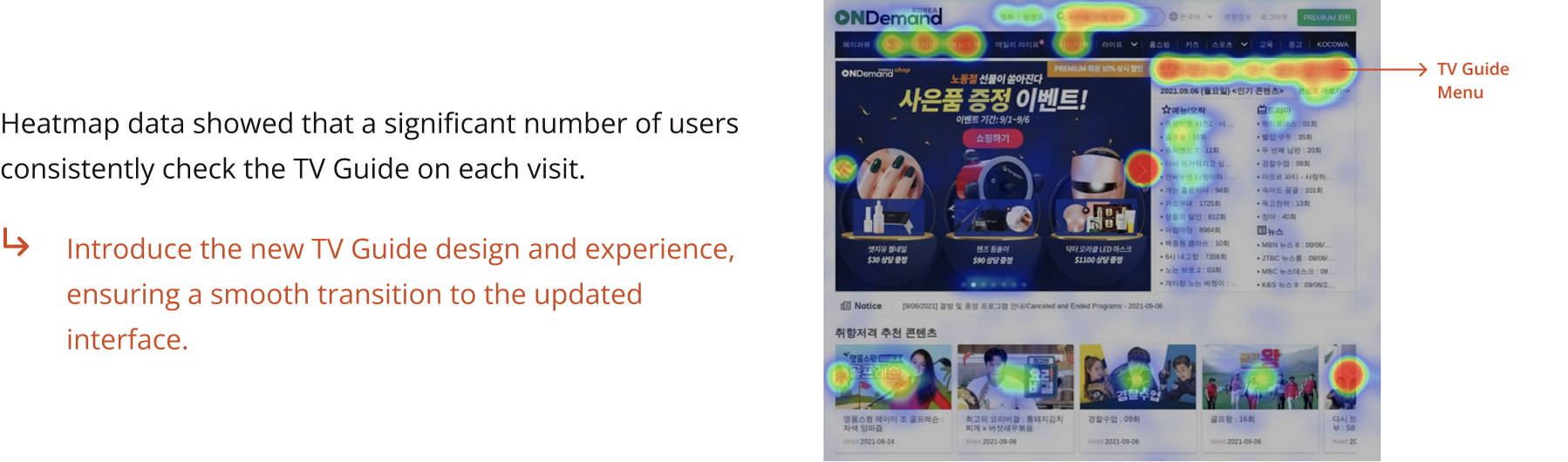
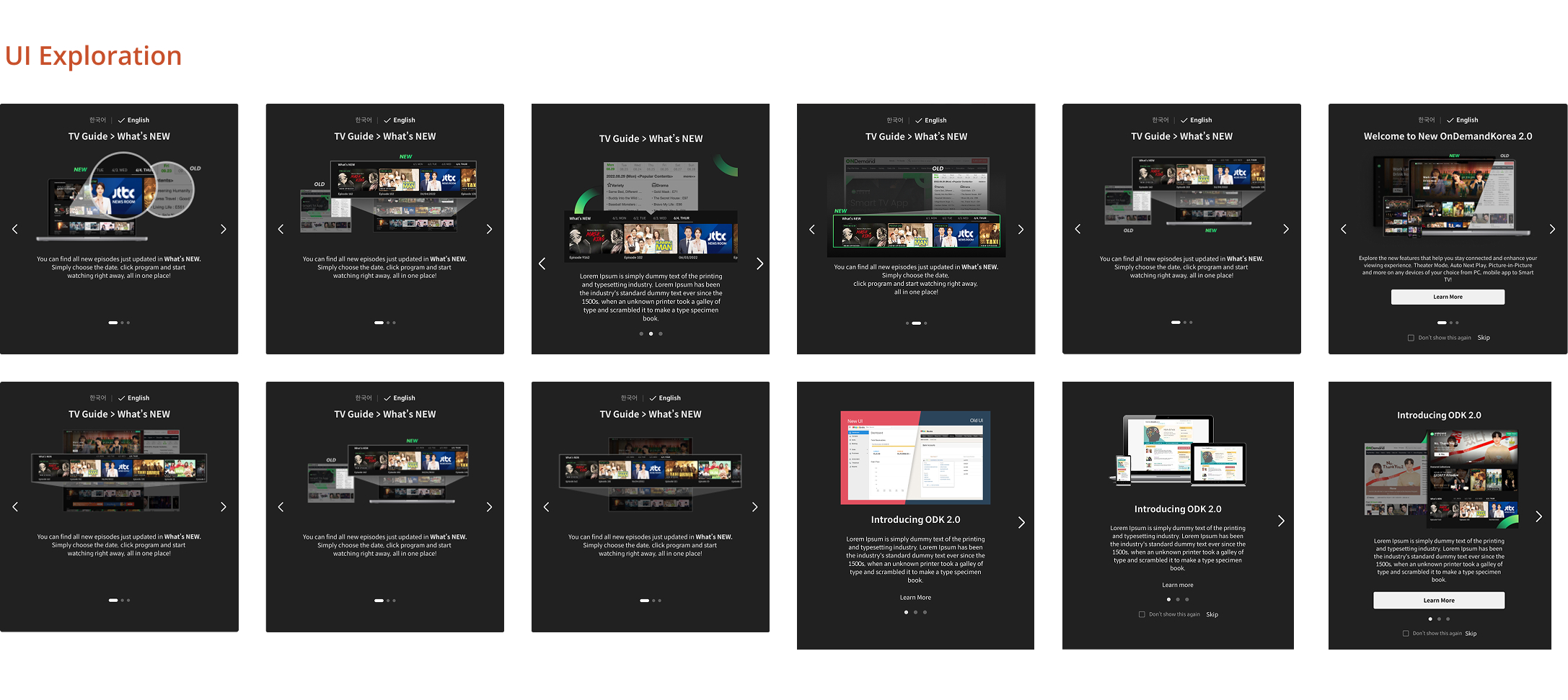
Heatmap data showed TV Guide was the most used feature, so I prioritized it in the new onboarding flow.
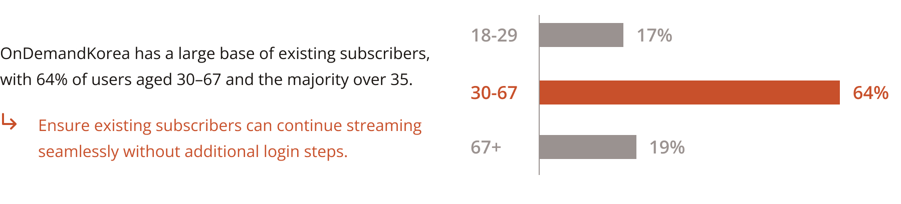
We analyzed subscriber data and homepage heatmaps to understand user behavior. Key findings: the majority of subscribers were aged 30-67, and the TV Guide section received the highest engagement. This informed the content priority in the new onboarding experience.
Engineering was uncertain whether existing user sessions could be preserved during the migration, which could force users to re-login and impact retention.
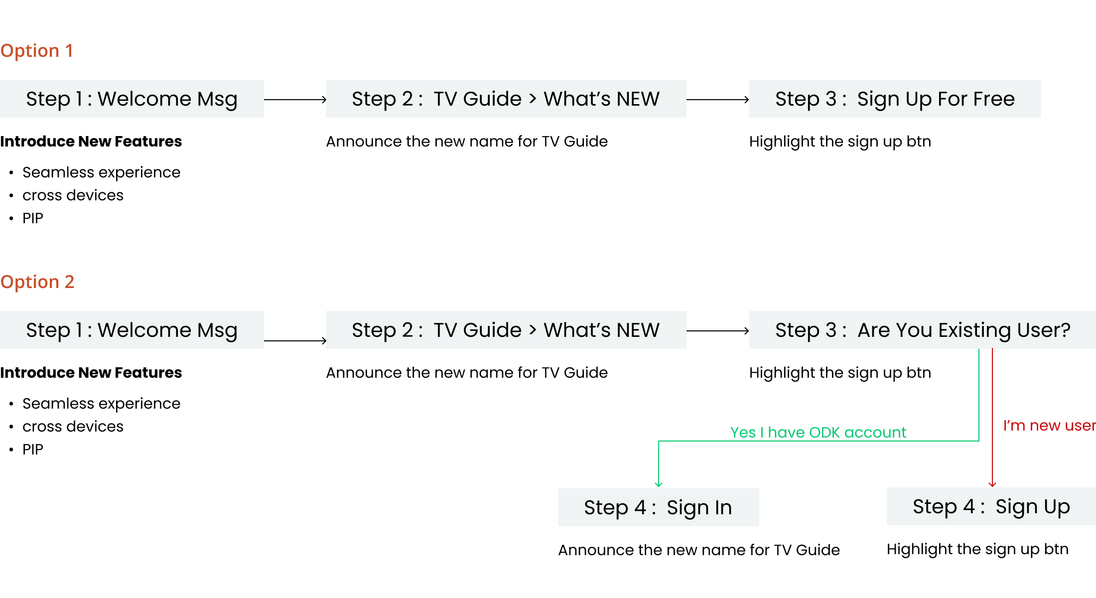
Rather than waiting for a technical decision, I designed two flow options that would both work regardless of the engineering outcome.
Option 1 keeps the flow to three steps, treating all users the same for the fastest path to completion. Option 2 adds a branching step that separates new and returning users for a more tailored experience, but adds friction for existing subscribers who make up the majority of the audience.
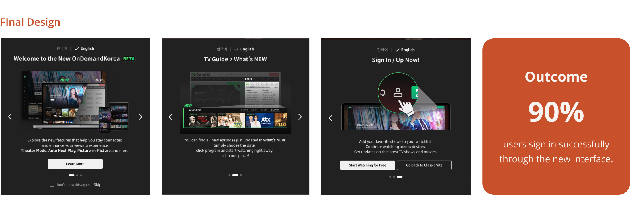
The simplified flow achieved a 90% successful login rate at launch.
After aligning with marketing, product, and engineering, we chose Option 1 for its simplicity. We refined the final CTA to "Sign In/Up Now" to serve both user types in a single step, and added a "Go back to classic site" option for users who weren't ready to transition.
Responsive Plan Comparison
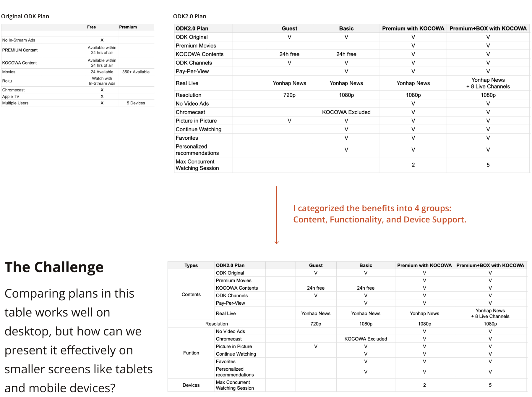
Plan comparison tables work on desktop, but how do you present complex plan details on mobile without losing context?
As the company expanded from two subscription tiers to multiple plans with different content providers and device options, users needed a clear way to compare their choices. The original table format broke down on smaller screens.
Most competitors either shrink the table to fit or use horizontal scrolling, both of which cause users to lose context.
Scaling the table down makes content too small to read. Horizontal scrolling causes users to lose sight of the row labels, so they see checkmarks but no longer know what they represent.
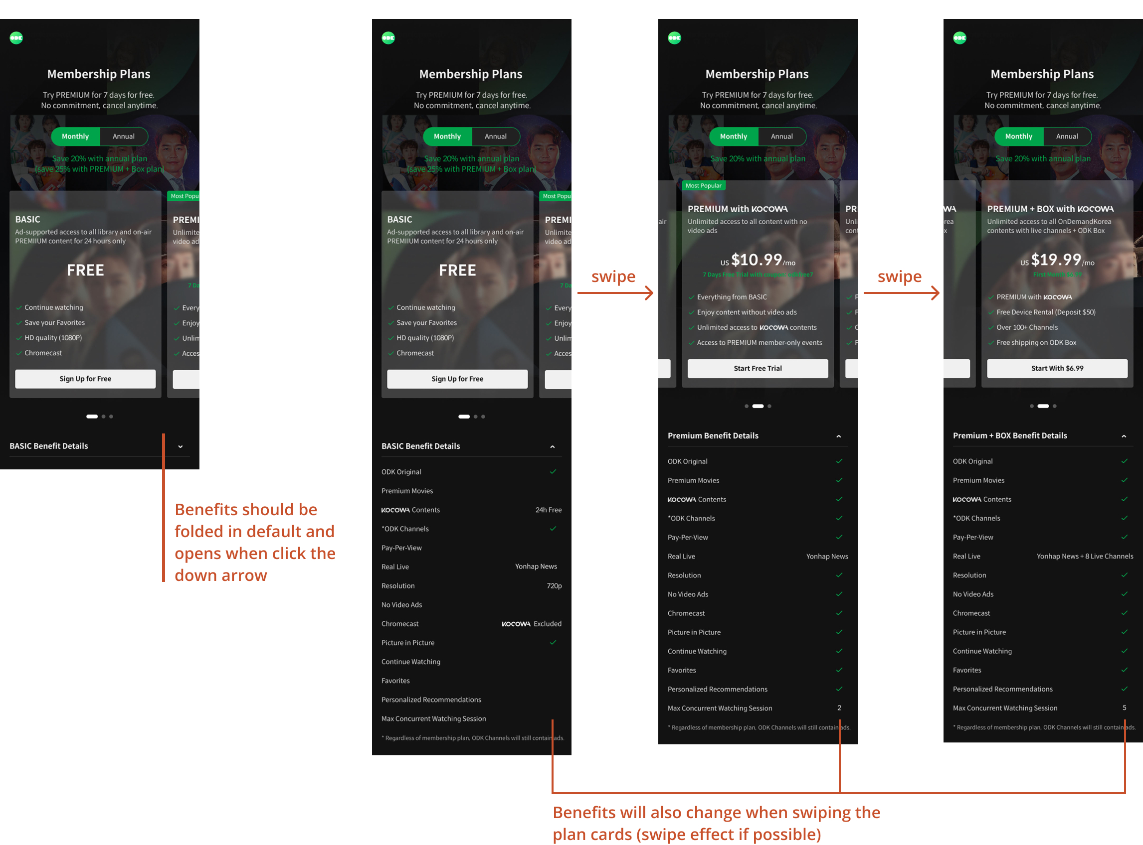
I fixed the benefit categories on the left and synced the plan cards with a horizontal swipe, so users can compare plans without losing context on any screen size.
Similar to how a frozen column works in a spreadsheet, the benefit categories stay fixed while plans swipe horizontally. I also synced the plan card header with the swipe gesture, so as users swipe from Guest to Basic, they immediately see the "Pay Per View" check appear as they move to a paid tier.