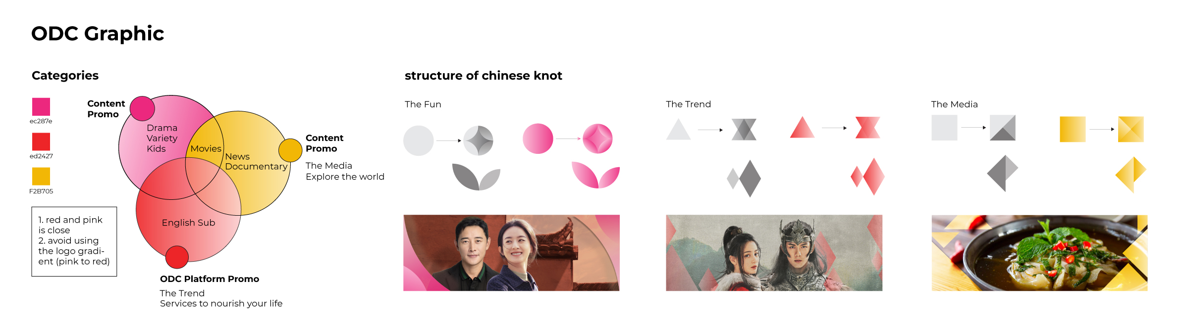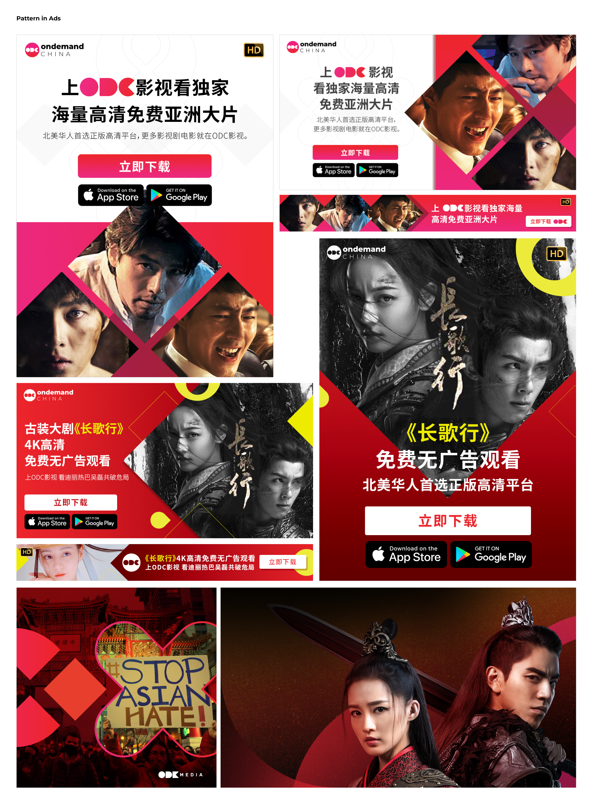
OnDemandChina (ODC) is one of three streaming services under the same company, each serving a different language audience — ODC for Chinese, ODK for Korean, and ODV for Vietnamese. To connect better with the target audience while also bringing depth to the brand identity, they needed a unique graphic pattern that reflected its cultural identity. Starting from research into traditional Chinese visual motifs, I developed a graphic system inspired by the form of Chinese knots and applied it across digital ads, social media graphics, and banners.
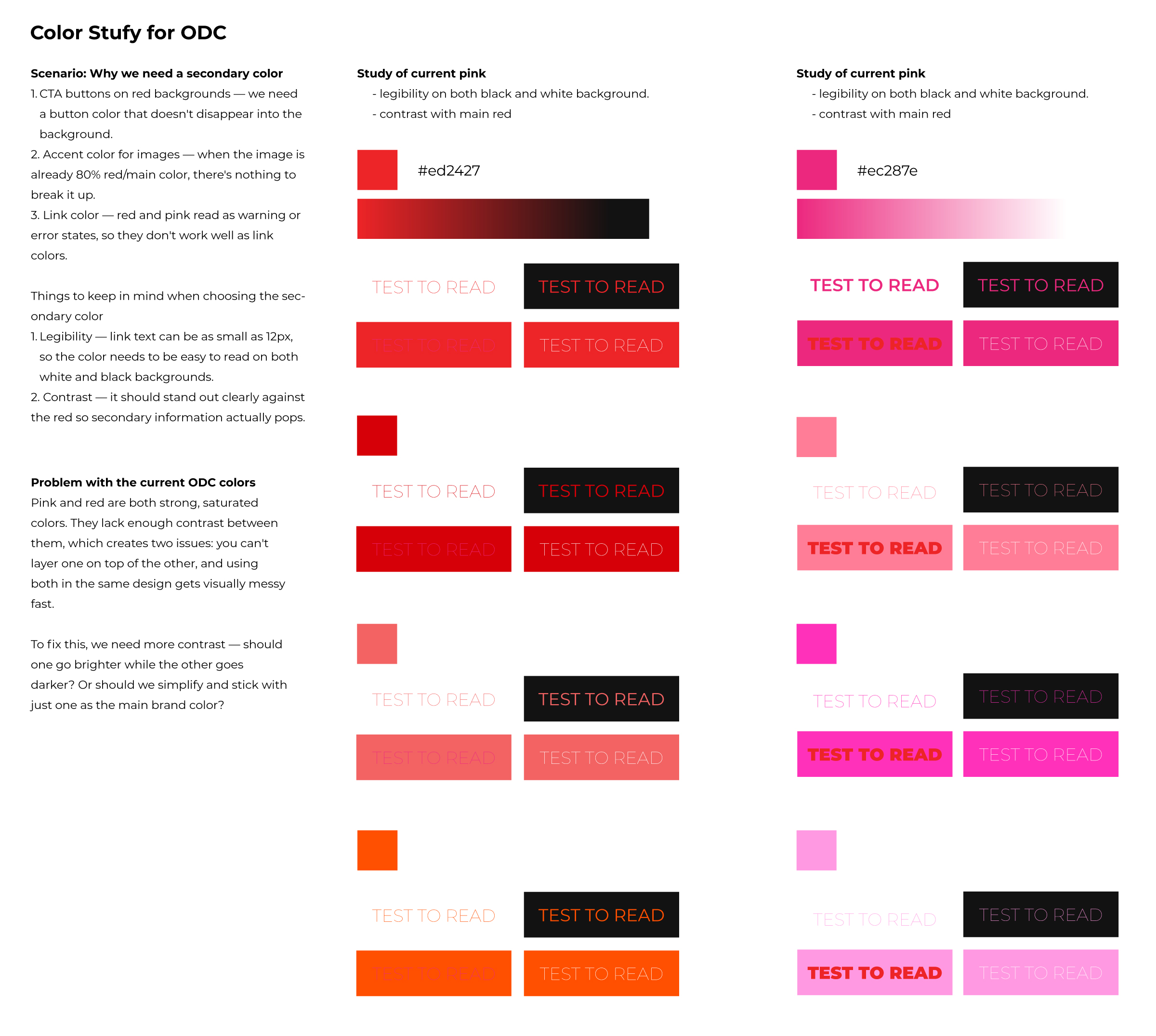
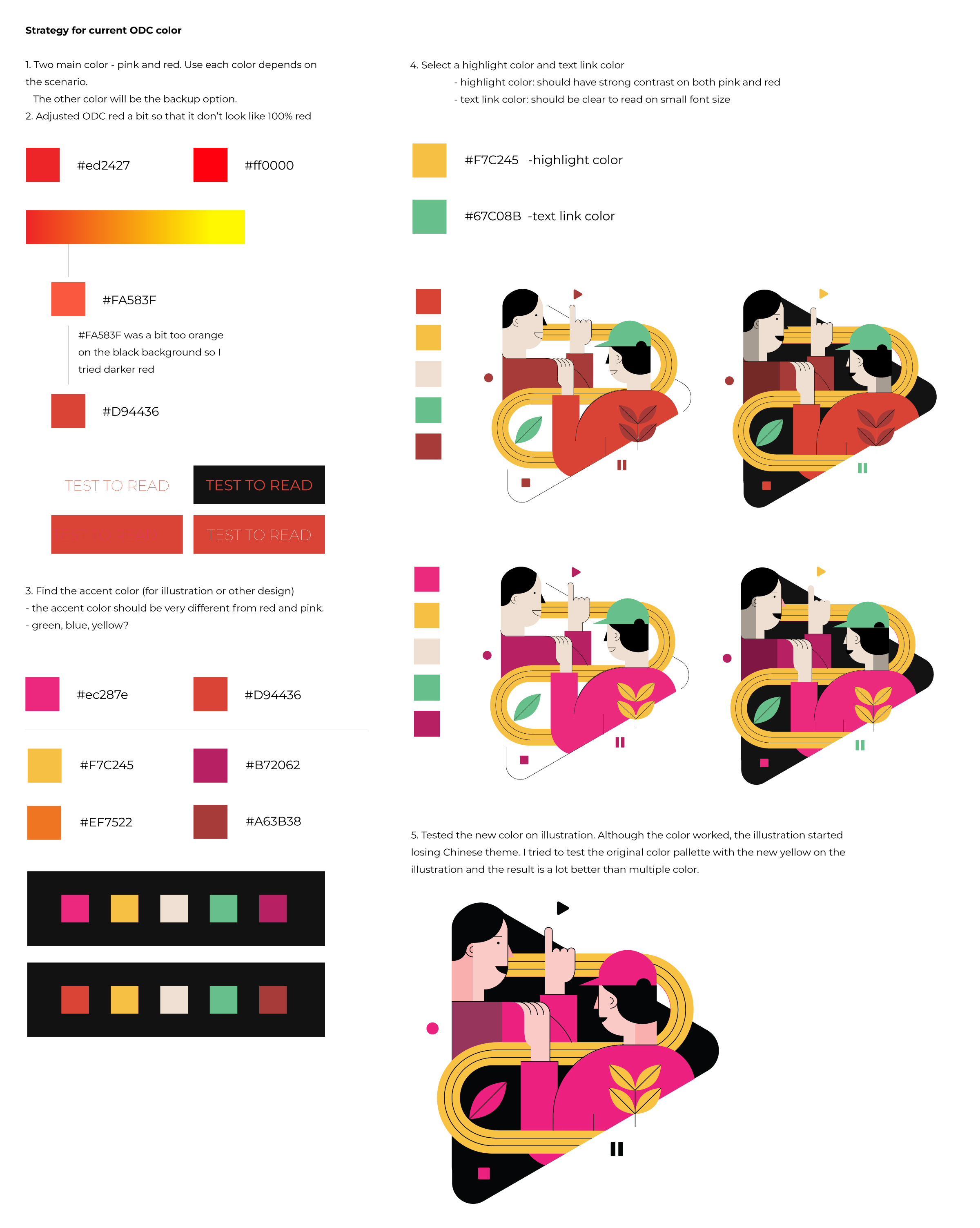
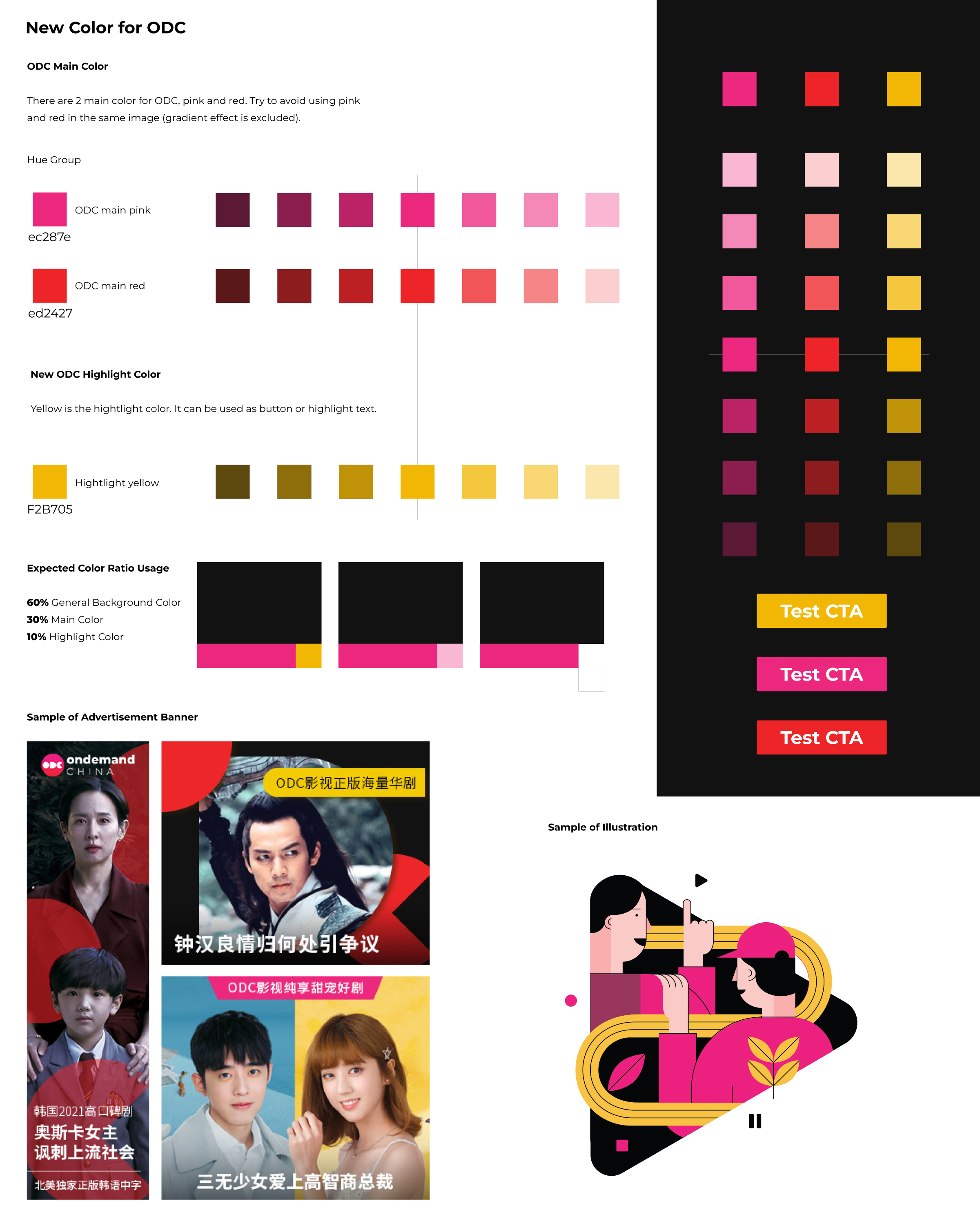
ODC's brand palette only had two main colors: red and pink. To support more diverse ads and banners and add options for call-to-action buttons, I conducted a deeper study of the color system.
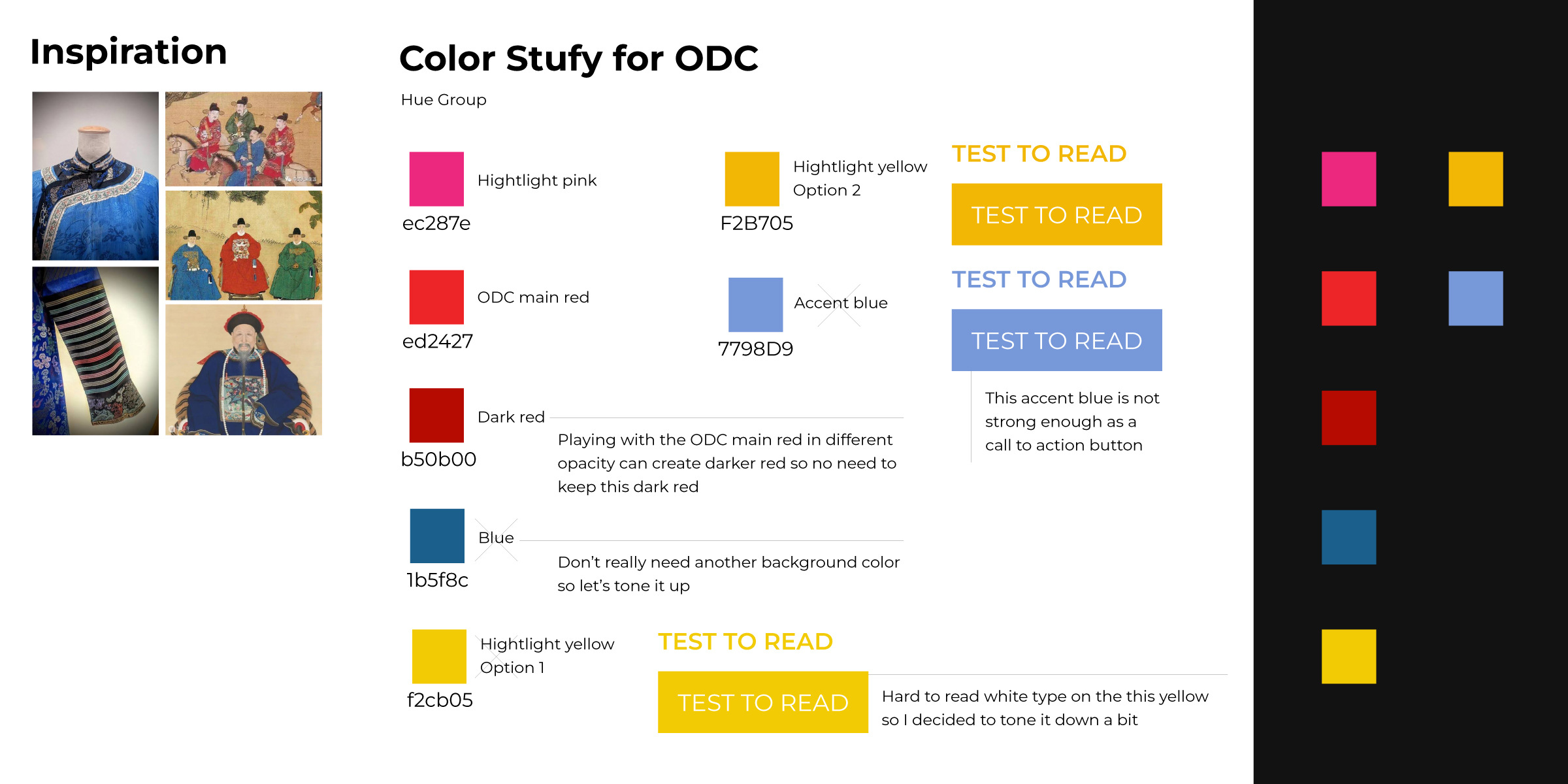
While expanding the palette, I also needed to maintain ODC's connection to Chinese culture. I researched colors found in traditional Chinese clothing and porcelain, selected combinations that complement the existing brand colors, tested how they perform against dark backgrounds, and introduced a yellow accent color to expand the palette's versatility.
Pattern is one of the key visual elements that builds strong brand recognition, brings depth to a brand identity, and creates a connection between users and the brand experience.
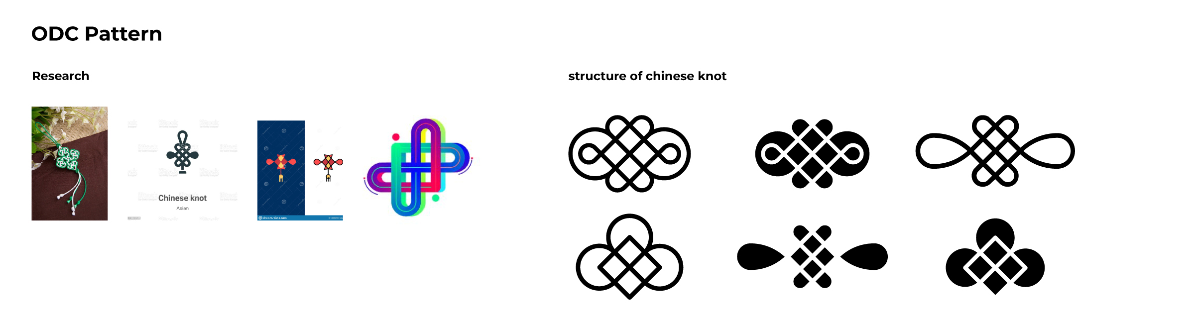
I began by researching visual elements found in traditional Chinese architecture, clothing, and painting. A recurring theme I noticed was the emphasis on symmetry in Chinese visual culture. Among these motifs, the Chinese knot stood out — it symbolizes connection, which directly mirrors what ODC does: connecting Chinese users to the content they love. I then studied the knot's structure and line flow more closely to explore how its forms could be translated into a graphic pattern for brand communications.

With the expanded color palette and the new pattern in place, I applied the new visual system across digital ads, social media graphics, and banners.