A biotech startup had no established design guidelines beyond a logo and three brand colors, and needed a scalable visual foundation before building their website.
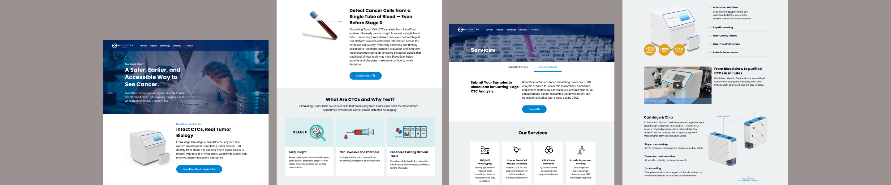
BloodScan Biotech isolates intact circulating tumor cells (CTCs) directly from blood using proprietary analysis technology. When I joined, the existing website lacked a clear connection to the brand identity. I was brought in to design a new website, but I proposed starting with a design system first, so every design decision could scale to future touchpoints like presentations, print materials, and future digital products.
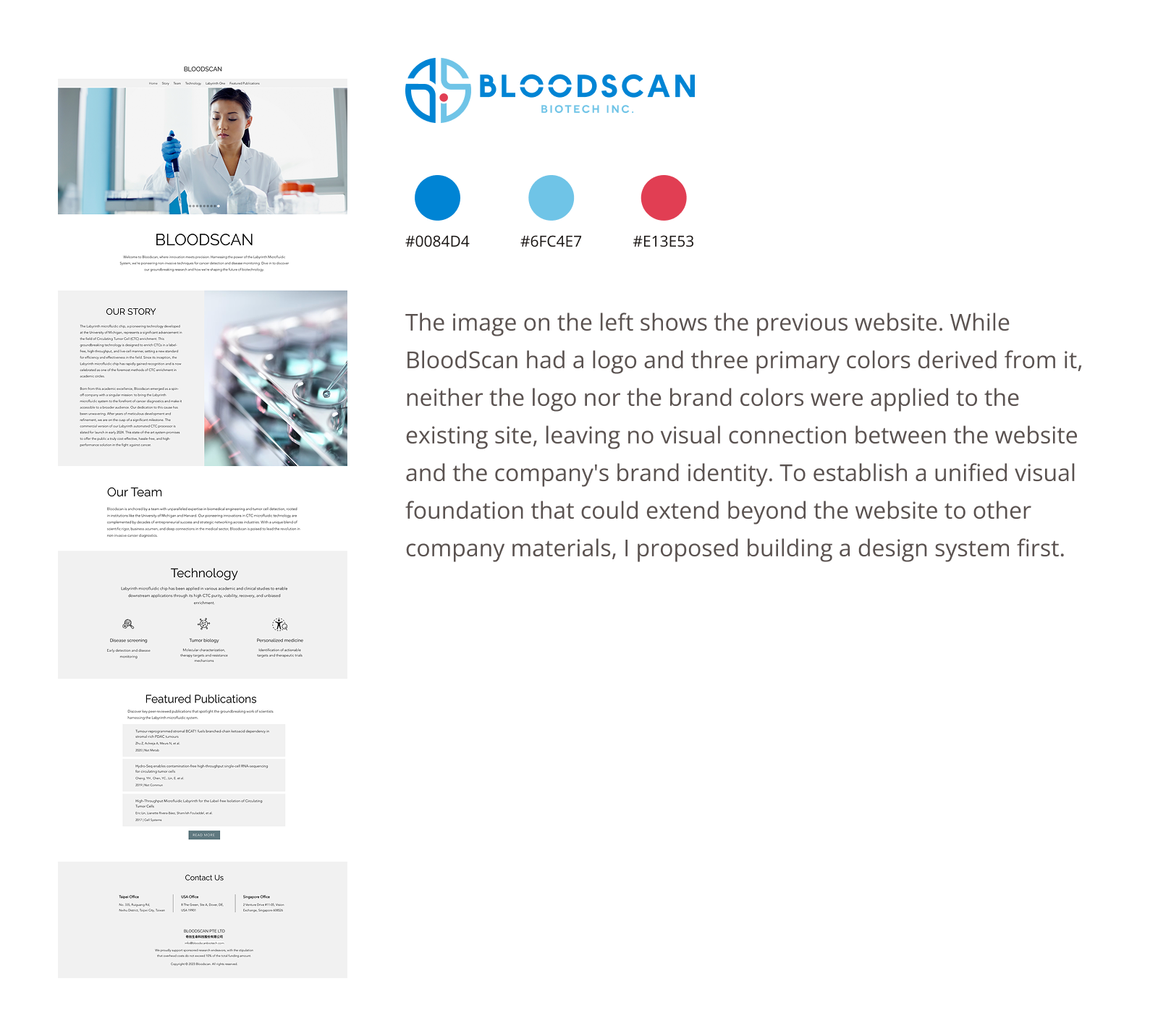
I proposed building a design system before the website, so every decision could scale beyond a single project.
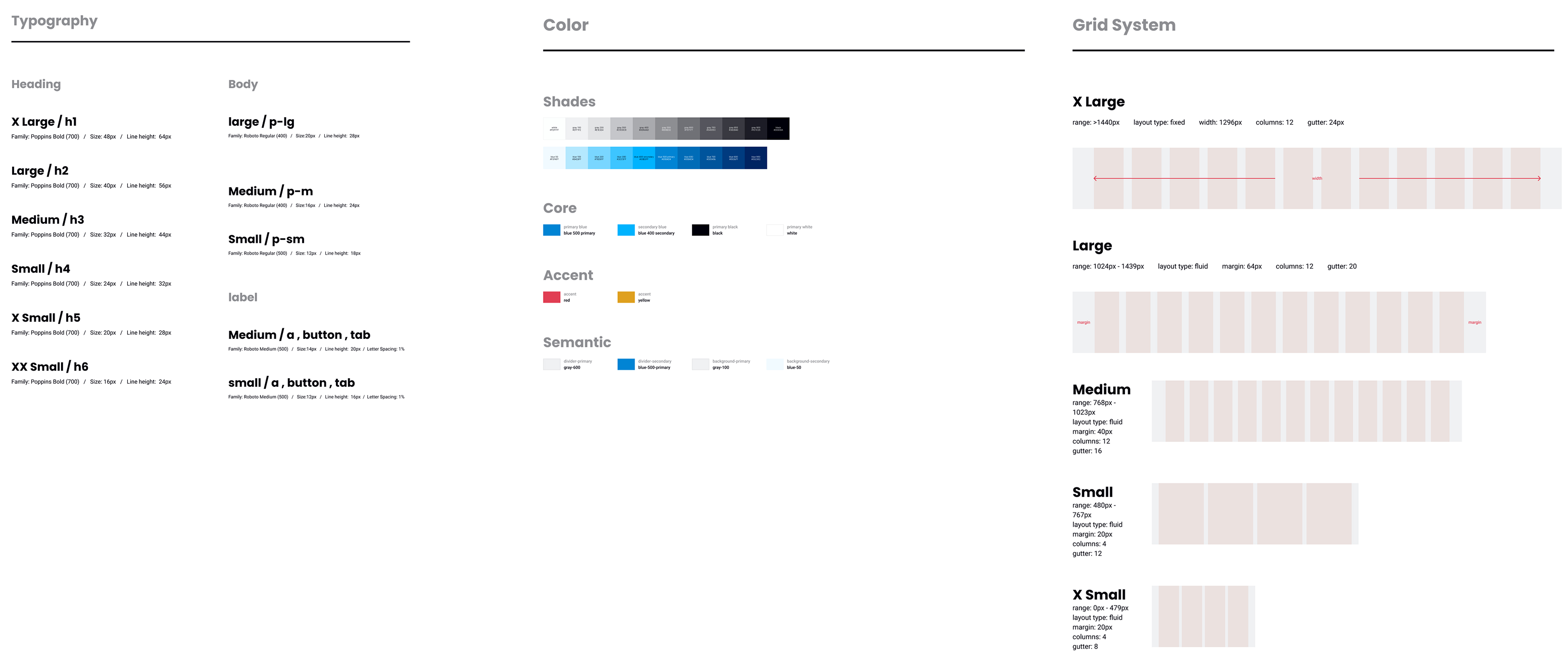
I referenced established systems like Uber's Base and Ant Design for their foundation settings such as typography scales and font hierarchy, because their structures are well-suited for web applications and offered a clear starting point for a small team. I also adopted Atomic Design principles to organize components into a scalable hierarchy.
Design the pages first, then extract reusable components based on actual patterns.
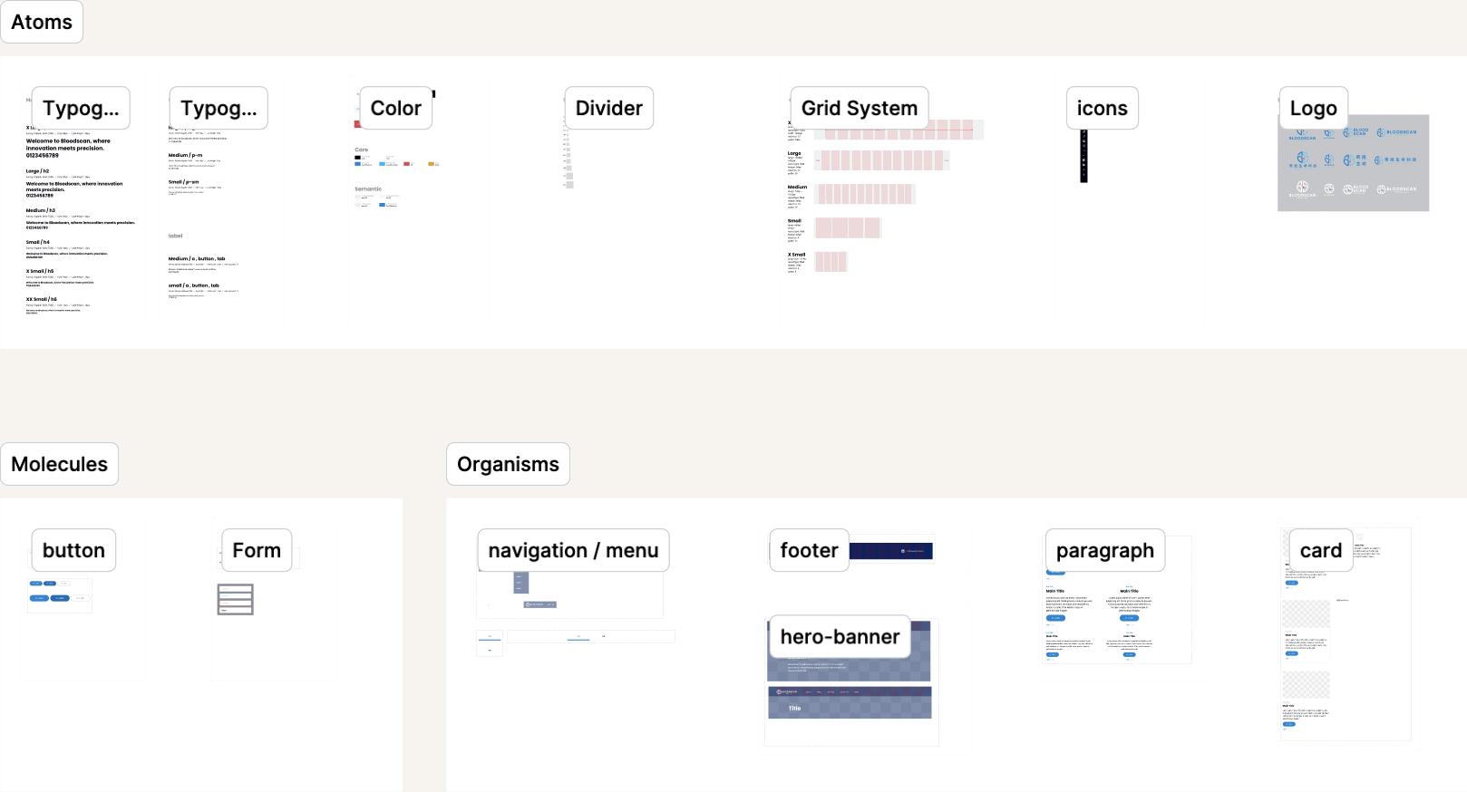
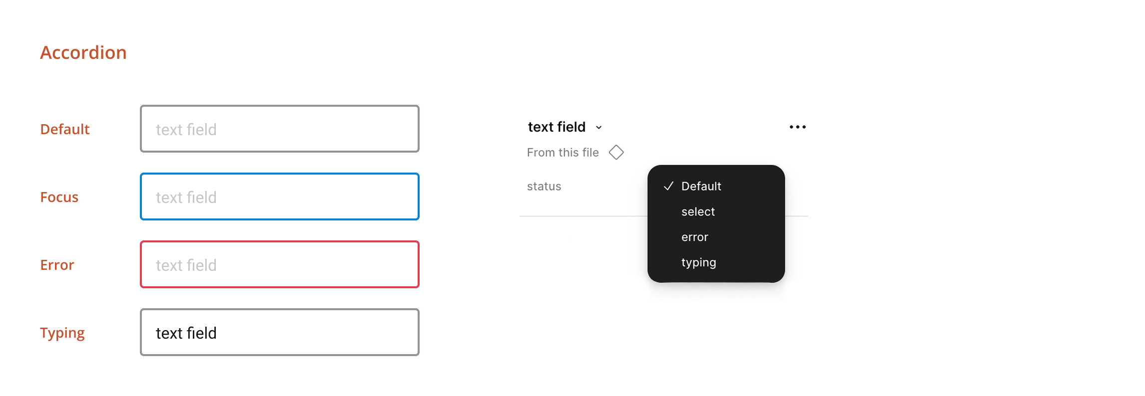
My initial approach was to create components as I designed each page. But components built too early often needed to differ slightly across pages and couldn't be reused as expected. I shifted to a more effective workflow: complete the page designs first, then extract only the elements that appeared consistently. This resulted in a focused set of around 10 core components with variants, keeping the system lean and maintainable.
Figma's free plan limits files to three pages, so I had to build both the design system and website design within this limitation.
This constraint forced me to keep the system lean and intentional. For typography, I started with a minimal scale of H1 through H4, paragraph, and label, then expanded only when real needs emerged during page design. For color, I extended the three brand colors into shade scales for interactive states and introduced accent colors for status indicators. Components follow an Atomic Design hierarchy: Atoms (typography, color, divider, grid system, logo), Molecules (button, form, navigation/menu), and Organisms (footer, paragraph, card, hero banner).
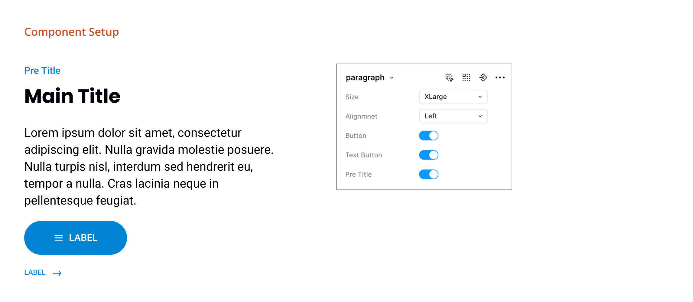
I implemented the website in Framer, importing Figma components directly to ensure design consistency carried through to production.
Framer supports importing artboards directly from Figma, so I could quickly rebuild components without starting from a blank canvas. When adjustments were needed after the site went live, I could update the design system variables in Framer and have changes reflected across all pages instantly.
The design system was adopted by a sister brand without modifications, validating the scalability of the system.
What started as a website project became a scalable visual foundation for the company. The founder began using the design system to create investor presentations, ensuring brand consistency across different touchpoints. The system was also adopted for ProtoDive's landing page, a sister service under the same company, directly reusing the Figma library without modifications.