Background
OnDemandKorea is an online streaming service launched in 2011. Initially, there was no membership plan, so a subscription page wasn’t needed. Later, when the company introduced a subscription plan, a membership page was quickly set up using Wix, as it was the easiest solution at the time. When we redesigned the entire OnDemandKorea site, we made the decision to integrate the membership page directly under the main domain.
Our Main Goal was to
Introduce the new membership plan with added KOCOWA content and ODK Box.
Discover
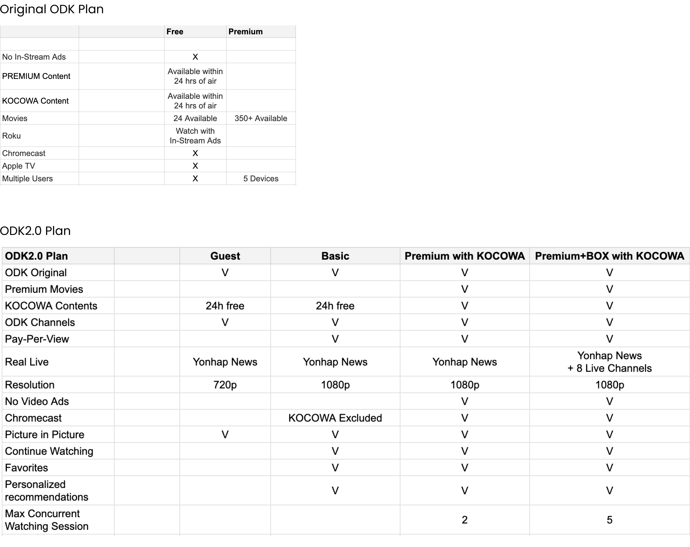
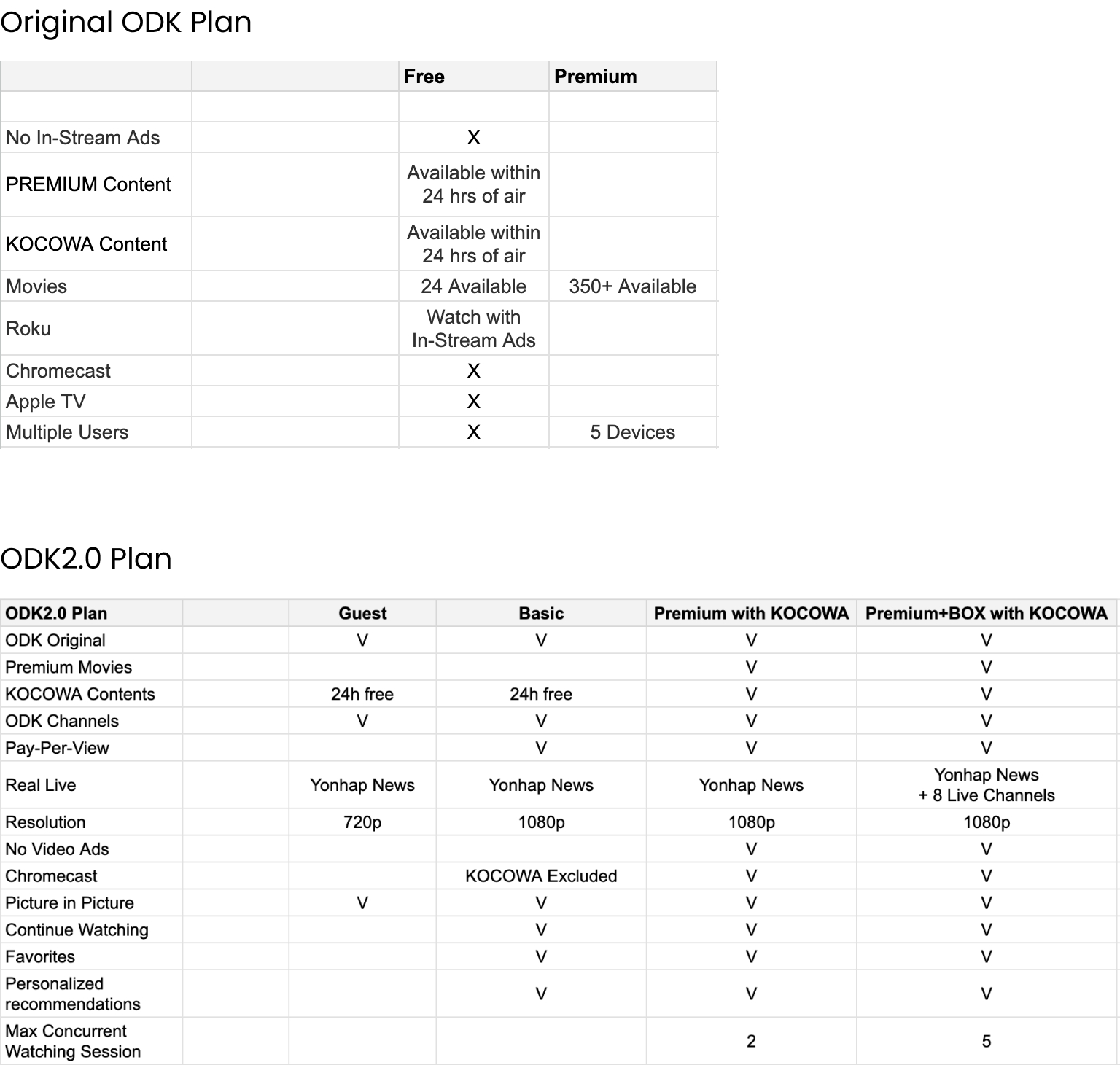
With the addition of a new content provider (KOCOWA) and the introduction of the ODK device (ODK BOX), the membership plan became more complex. Before diving into the new design, we first need to understand the differences between the old and new plans.
Difficulty
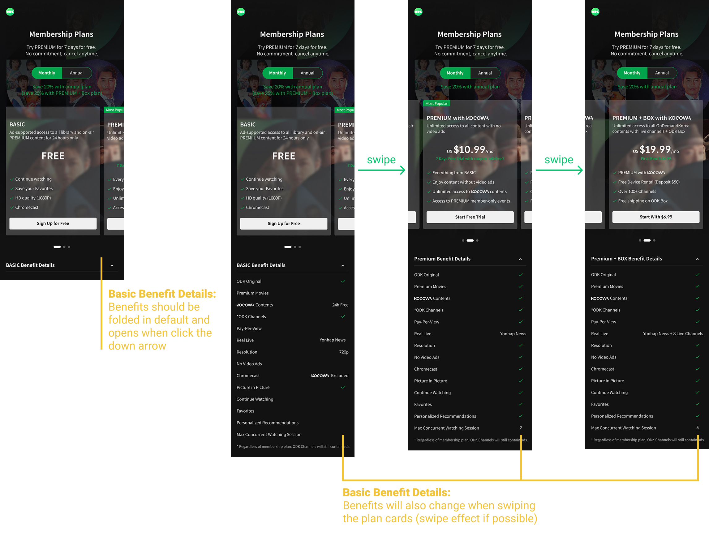
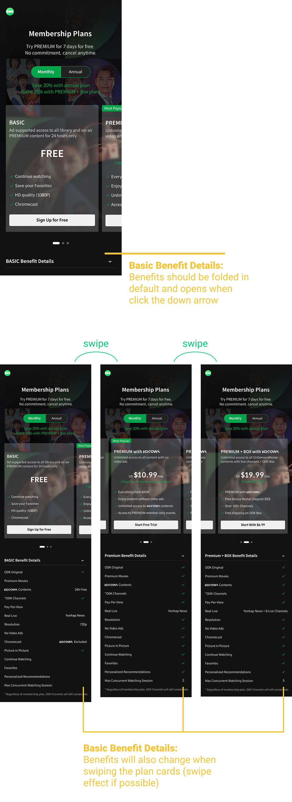
The subscription price is straightforward, but the details of each plan can be very different. To help users choose the best plan for their needs, we need to present all the details in a user-friendly format that displays well across different devices. Implementing this large chart on bigger screens wasn’t too difficult, but how can we make it easy for mobile users to compare each plan?
First Step
To improve clarity, we first categorized the benefits into 4 groups: Content, Functionality, and Device Support.
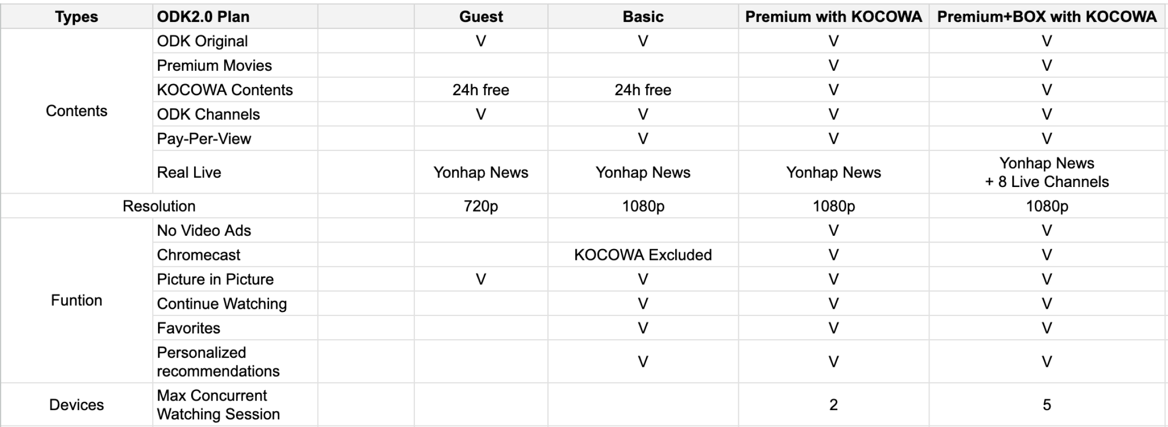
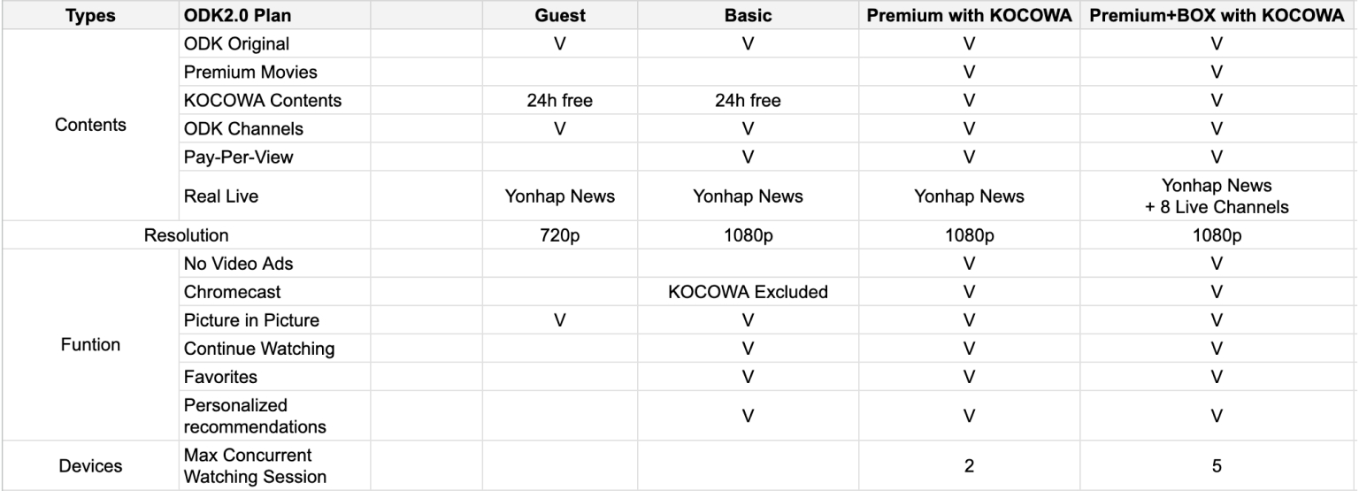
While categorizing benefits helps users navigate the information, the layout remained overwhelming. To address this, we highlighted the most relevant benefits directly on the plan cards.
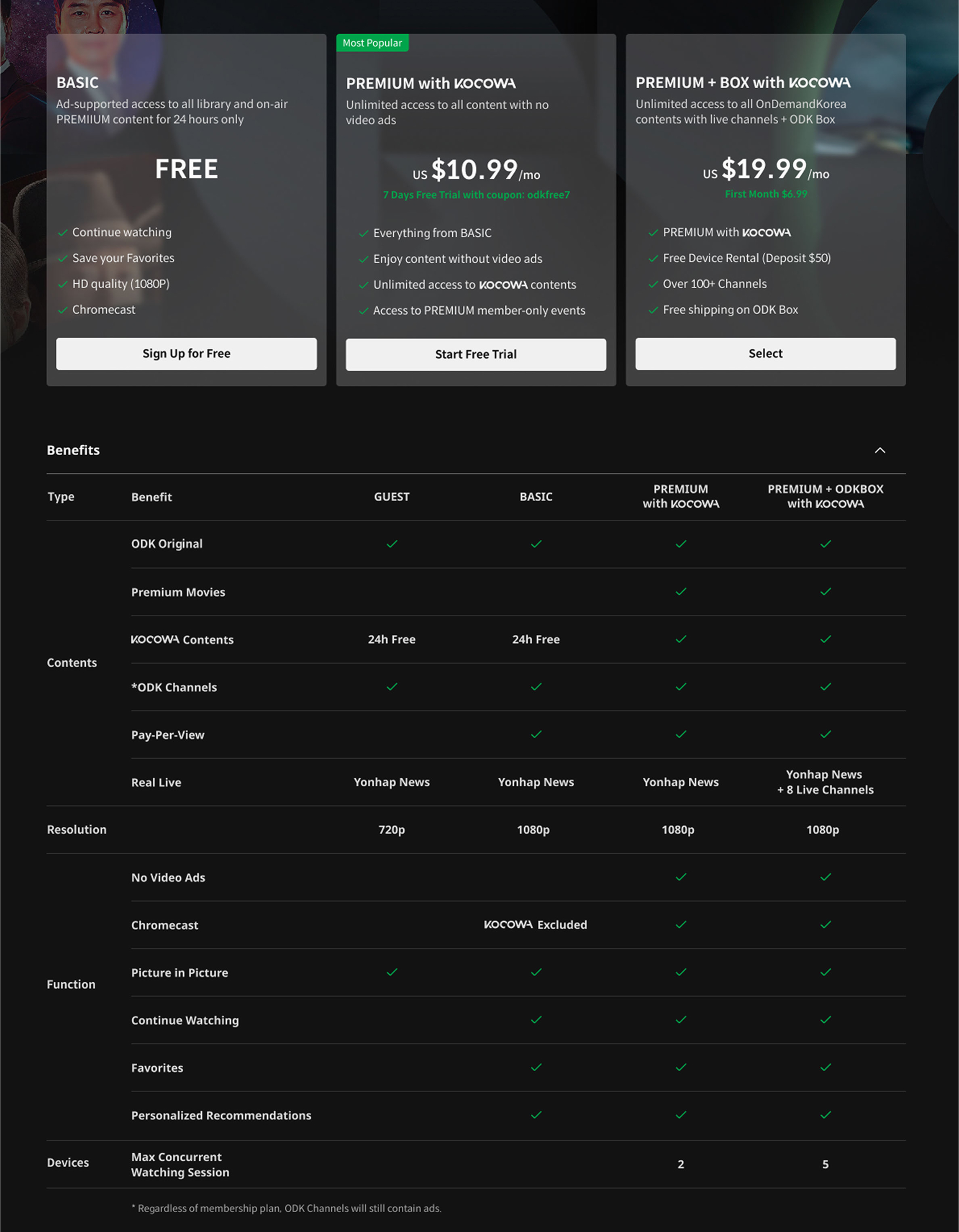
On mobile, we implemented a sliding layout that moves the form along with the plan card, making it easier for users to compare each option.