01 Overview
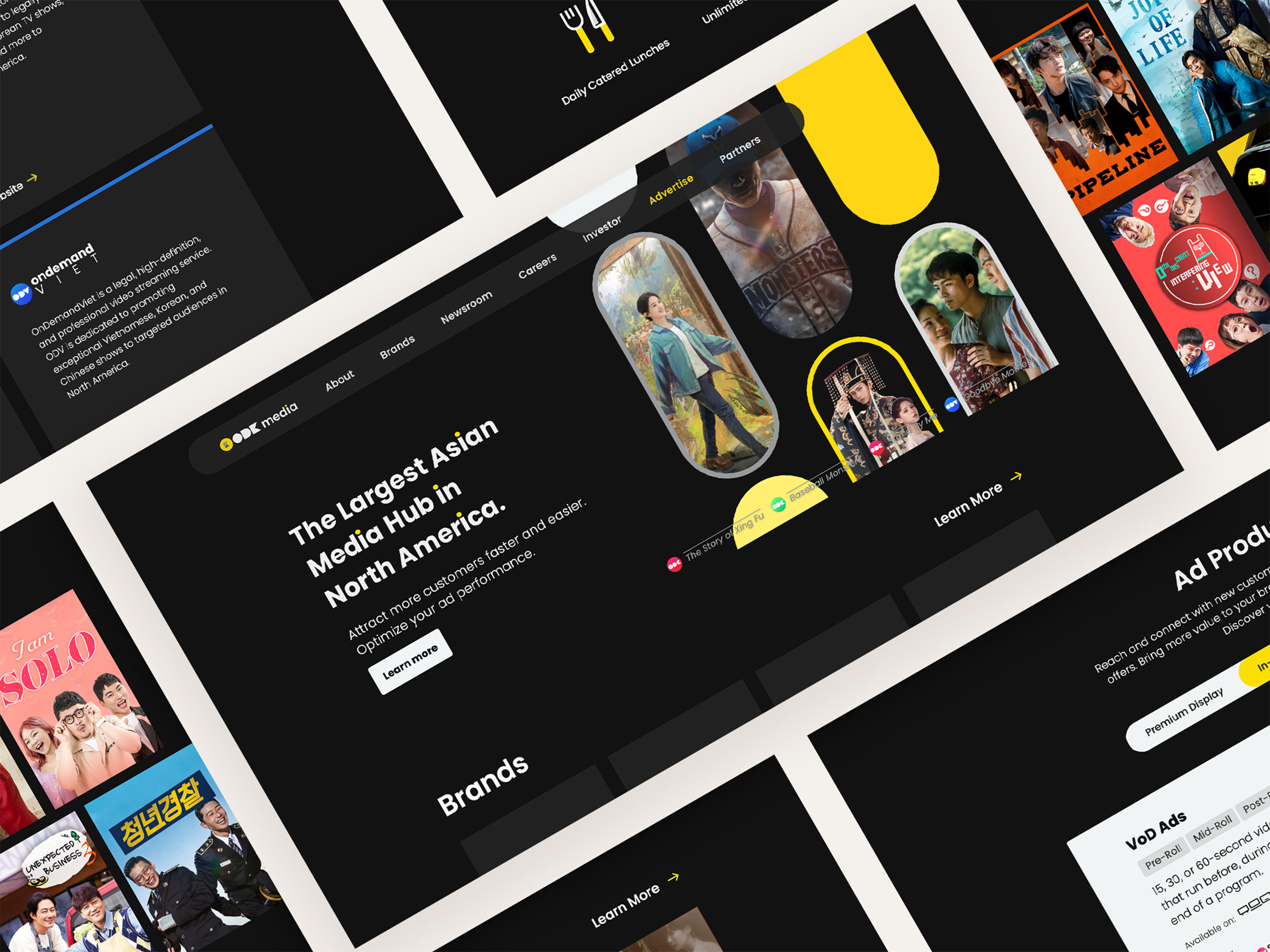
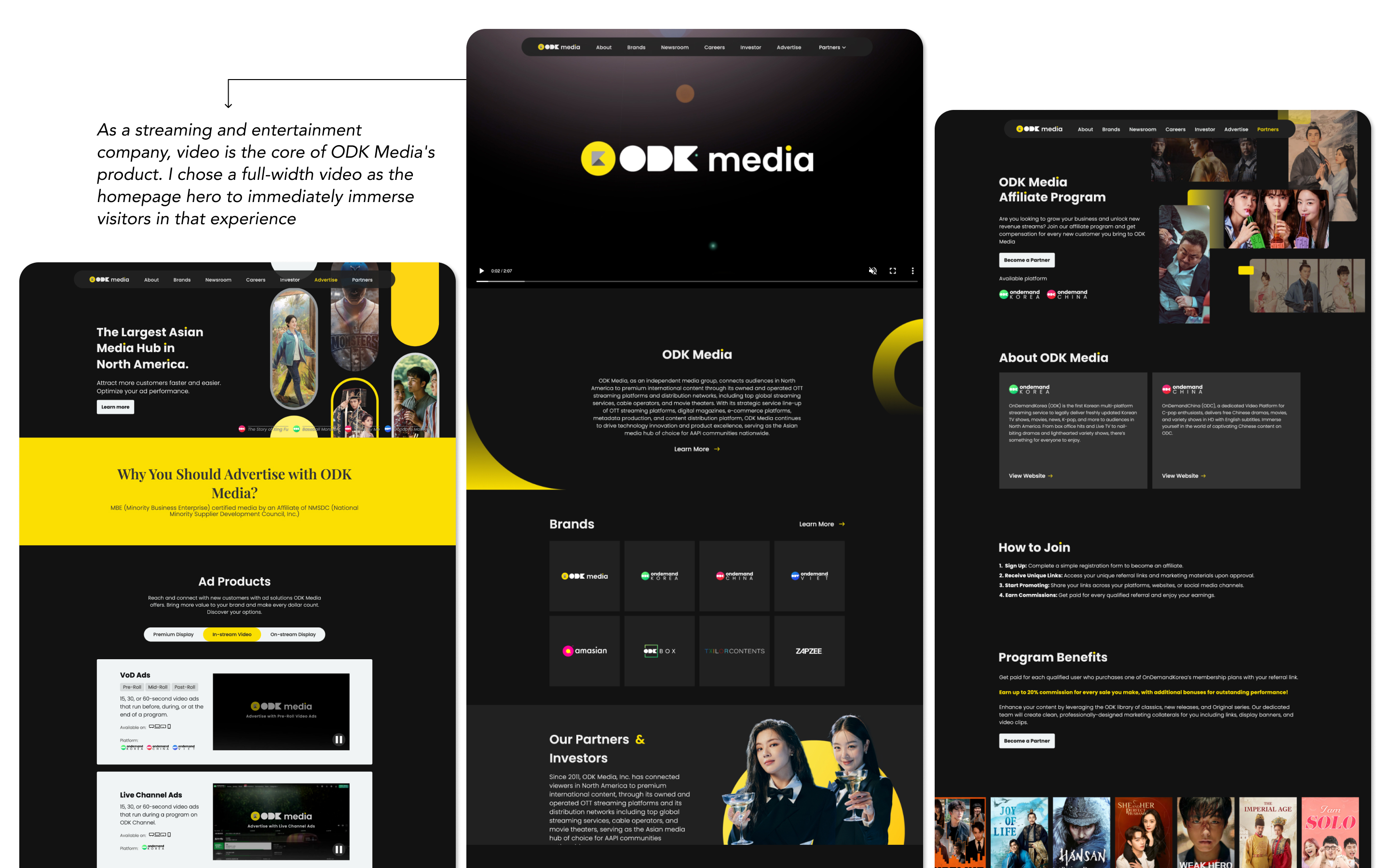
ODK Media is an entertainment company offering Korean and Chinese streaming services, digital magazines, and streaming TV boxes. Its existing website was a single-scroll landing page that no longer reflected the company's growing scale. The redesign aimed to create a comprehensive platform that could better represent ODK Media's expanding brand and portfolio.
The original website was a single scrolling page with no navigation, making it difficult to scale content or guide users. It also lacked a cohesive brand identity.

02 Challenge
The brand designer delivered new brand assets (logo, colors, and typography), but without UI components, spacing rules, or guidelines, every new page would require designing from scratch. Based on this, I set two goals for the redesign:
03 The Design System
I extended the brand colors and typography into a scalable design system foundation, defining color styles, text styles, and a grid system.
04 Site Design
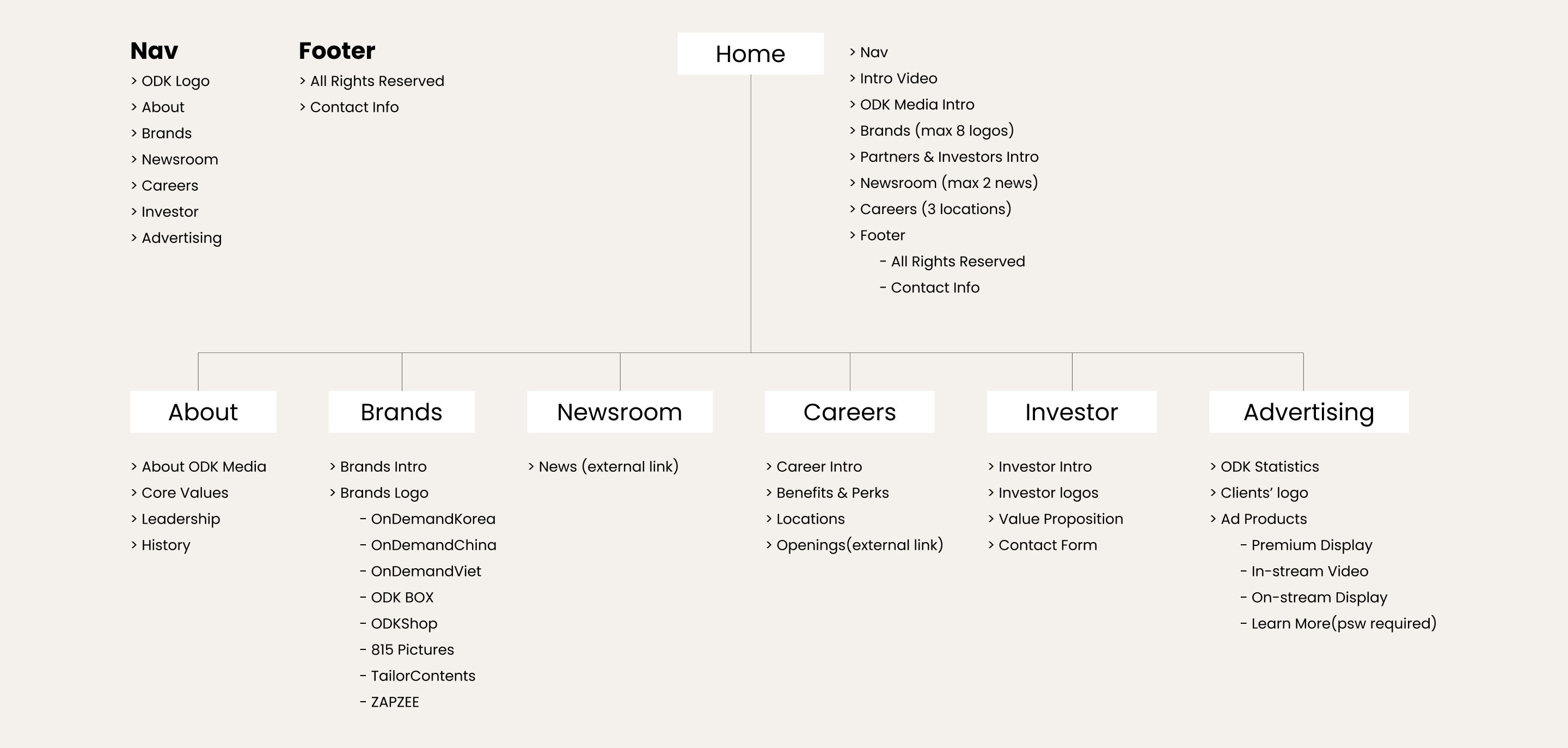
We worked with the cross-functional team to gather requirements for the new site, aligning on what content and features each department needed. I organized the input into the following site map and designed every page from there.
05 Bringing the Brand to Web
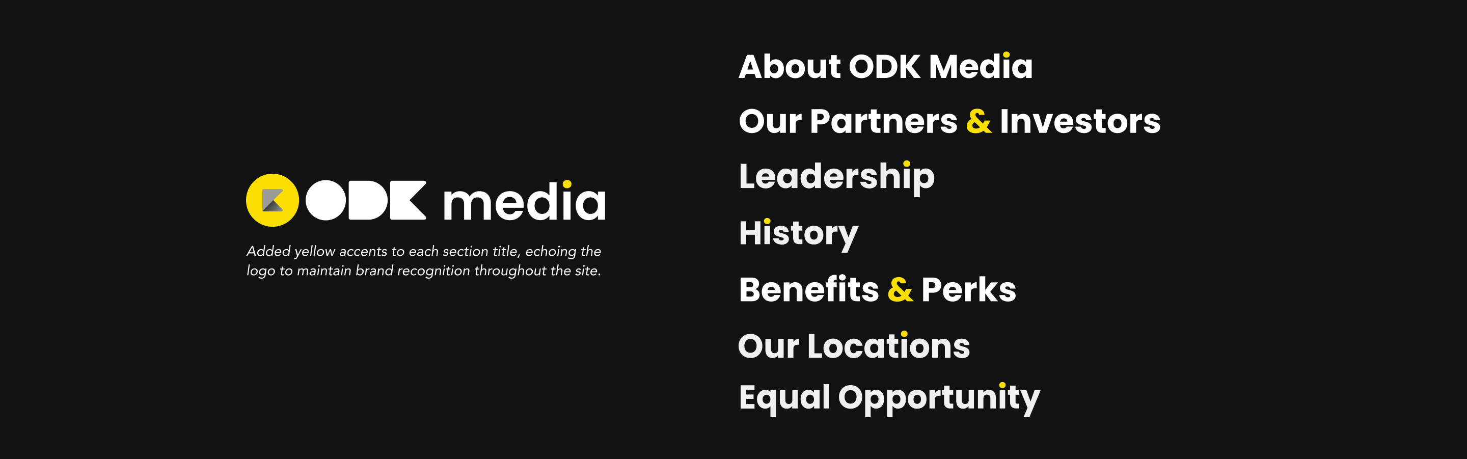
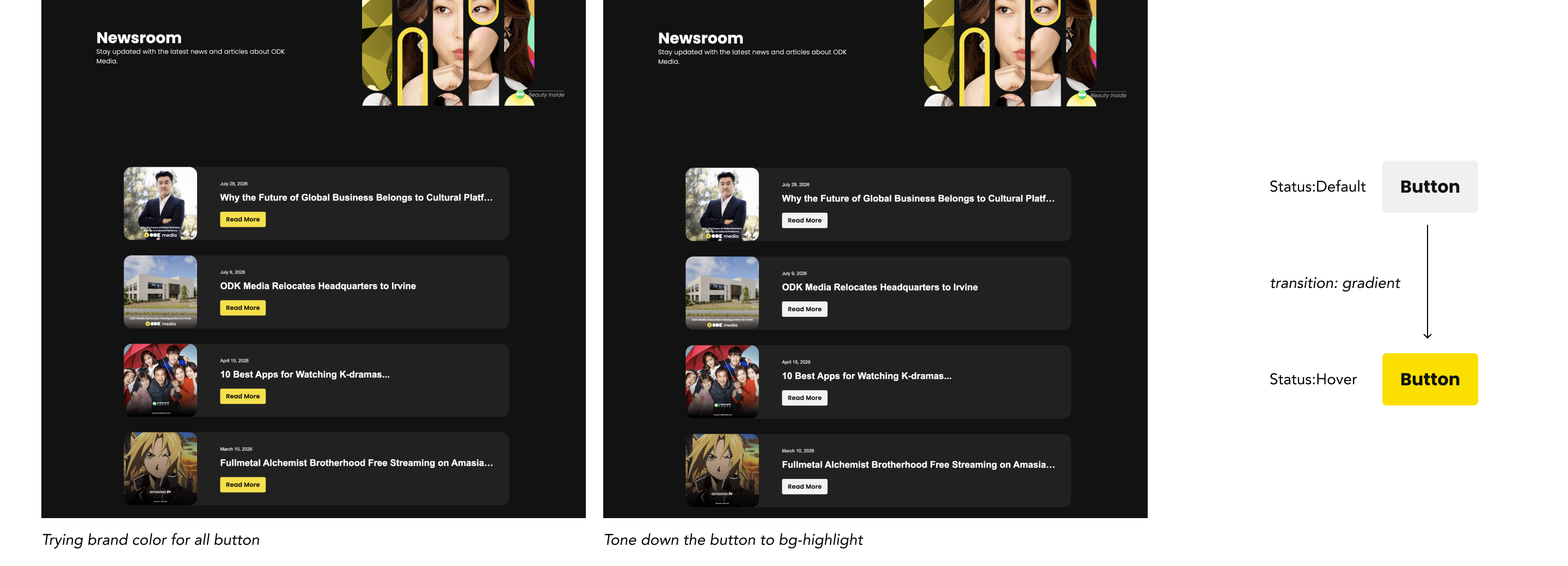
One challenge was the brand's primary yellow — using it on every button would overwhelm the page. Instead, I tucked the yellow into hover-state gradients, keeping the hierarchy clean while still reinforcing the brand on interaction. I also added yellow accents to each section title, echoing the logo to maintain brand recognition throughout the site.