
ODK Media refreshed its brand identity as the company expanded, but the website was still a single outdated landing page with no design language to carry the new brand forward.
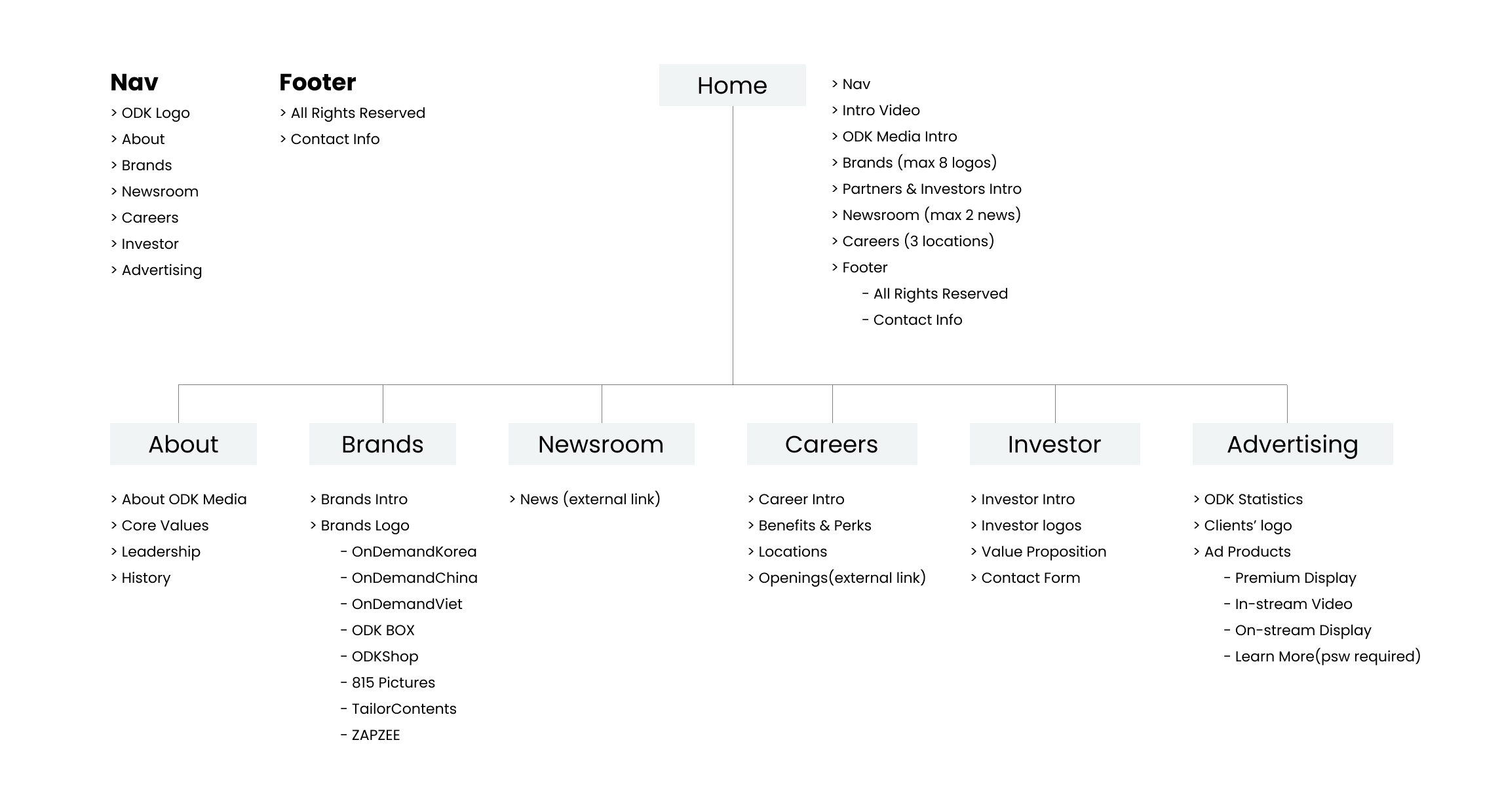
Below is the original website. The single scrolling page made it difficult to add more company information and offered no clear navigation for users to browse the site. It also lacked a recognizable brand identity.
The brand designer delivered new brand assets (logo, colors, and typography), but there was no plan for how they would translate to the website. Without UI components, spacing rules, or guidelines for how the brand should look and behave on screen, every new page would require designing from scratch. Based on this, I set two goals for the redesign:
1. Build a design system that translates the new brand identity into reusable components with consistent behavior (e.g. hover states, transitions) across the website.
2. Establish a stronger brand presence on the website that truly reflects the company's personality.
How I Translated Brand Identity to Foundation
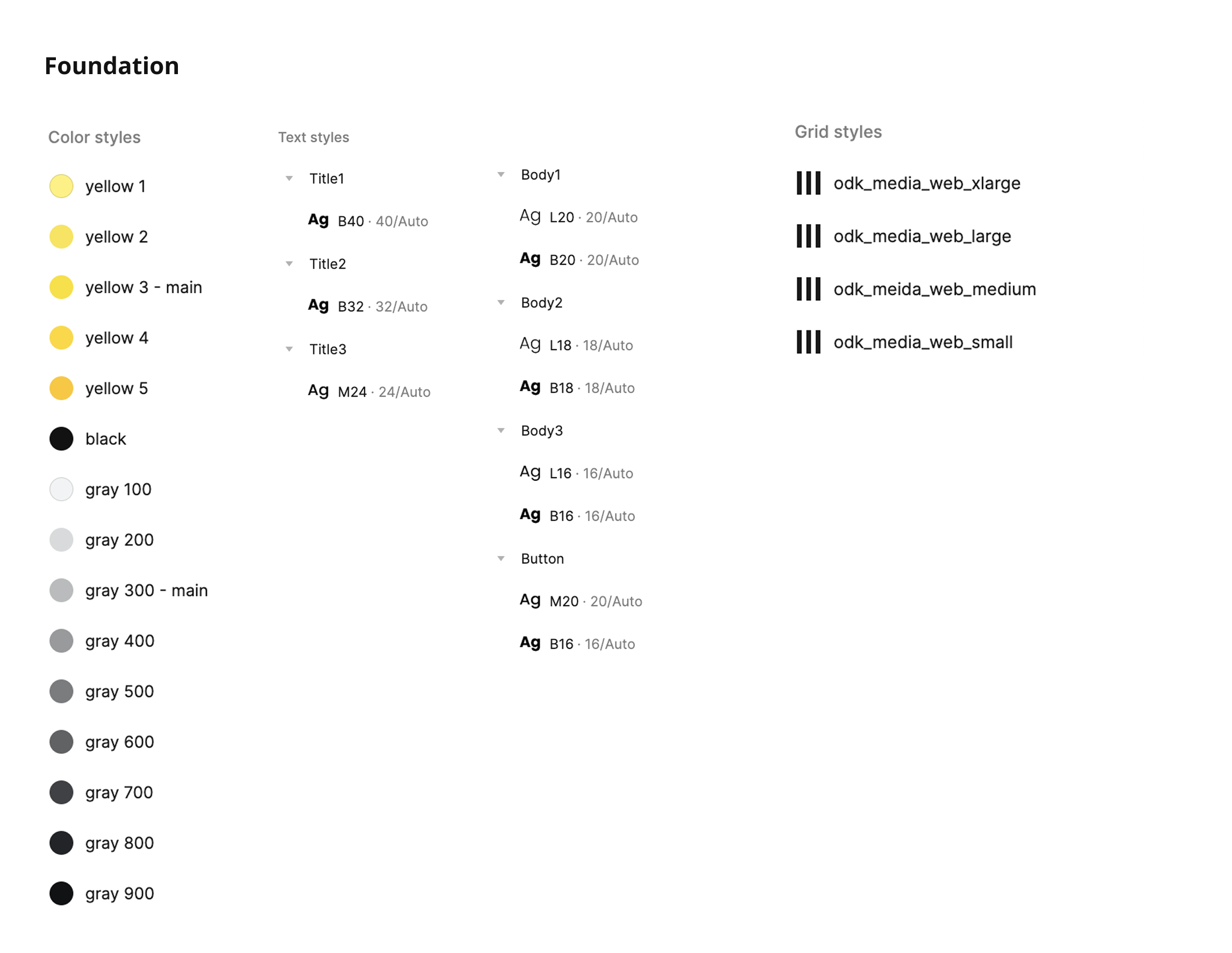
How I Blended New Brand Identity into Components
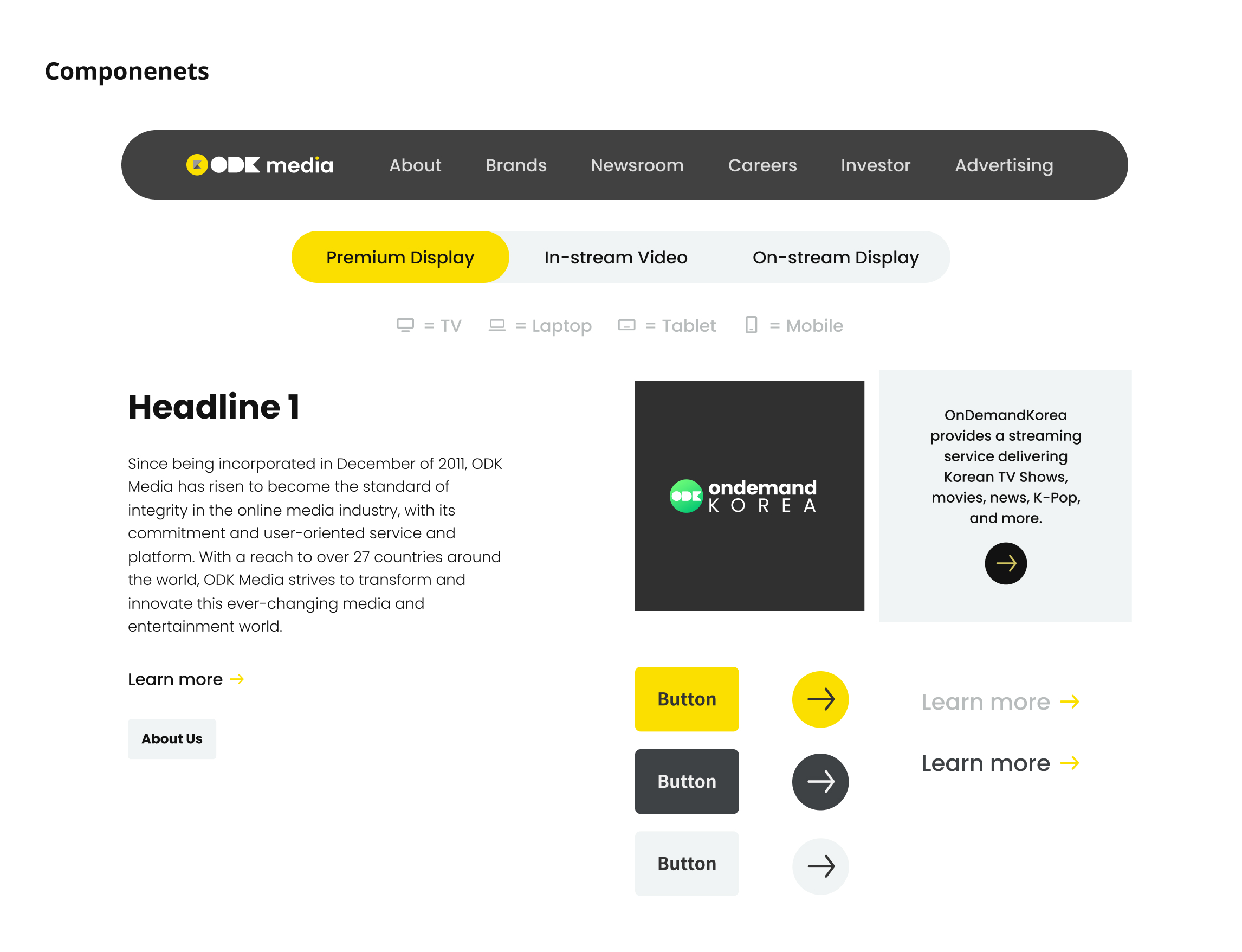
I used the brand's main color (yellow) to highlight interactive elements, making it immediately clear to users what is clickable. I also intentionally applied rounded corners to buttons and navigation to express the brand's friendly and playful personality.
How I Strengthened Brand Presence Beyond Colors and Typefaces
To strengthen brand recognition, I needed to go beyond applying brand colors and fonts. I customized the heading typography by highlighting the circular shapes in letters like "i" and "j" with the brand's yellow, creating a subtle but recognizable brand signature across every page. For the homepage hero, I used a full-screen video background to immediately connect visitors with ODK Media's core identity as a streaming service. I also replaced static icons with Lottie animations to bring energy and movement throughout the site, reinforcing the brand's playful personality.
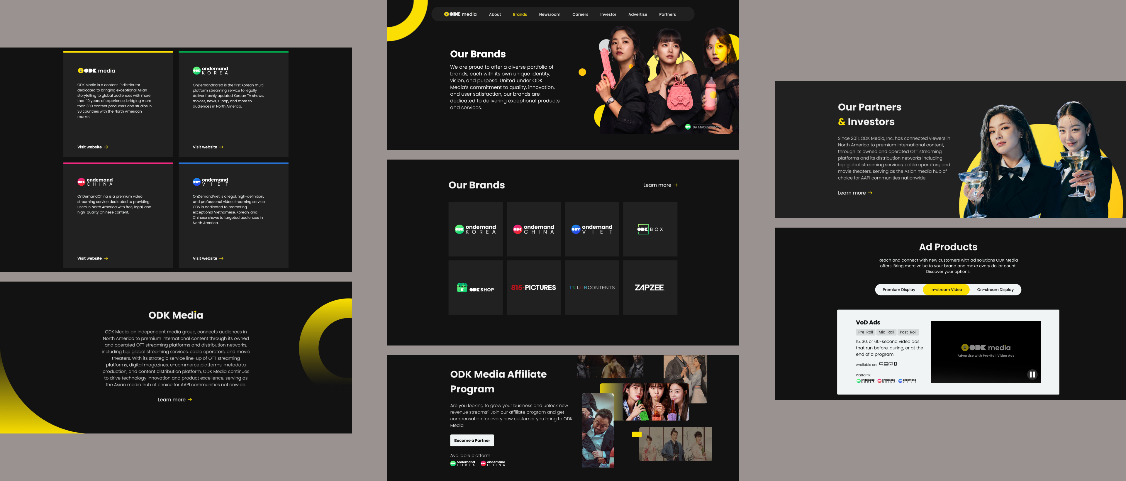
The redesigned website launched with a cohesive brand experience across 6 pages, and the design system made future expansion fast and effortless.
Shortly after launch, I was asked to design two additional pages for Affiliate and Partner programs. With the design system already in place, both pages went live within a week. The reusable components and established visual language significantly reduced repetitive work and made the whole design process more efficient.