01 Overview
Cooby is a B2B productivity platform that simplifies the sales process through an easy-to-use CRM, helping teams accelerate customer development. As an early-stage startup preparing to launch, Cooby needed a complete brand identity to establish its presence in the market.
02 Approach
After discussions with the team, we aligned on three keywords to define Cooby's brand personality:
Efficient, Professional, Sidekick
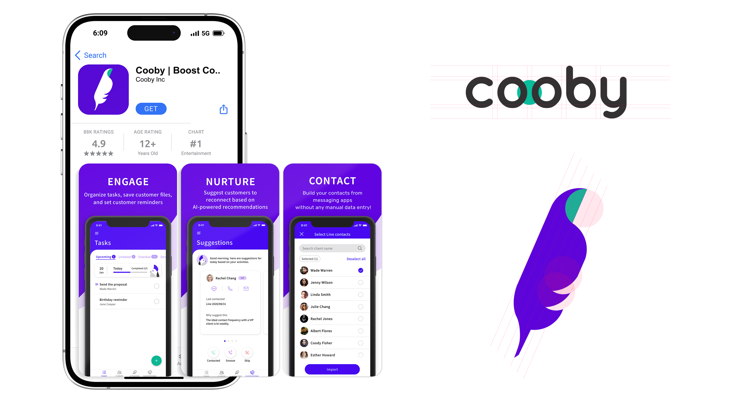
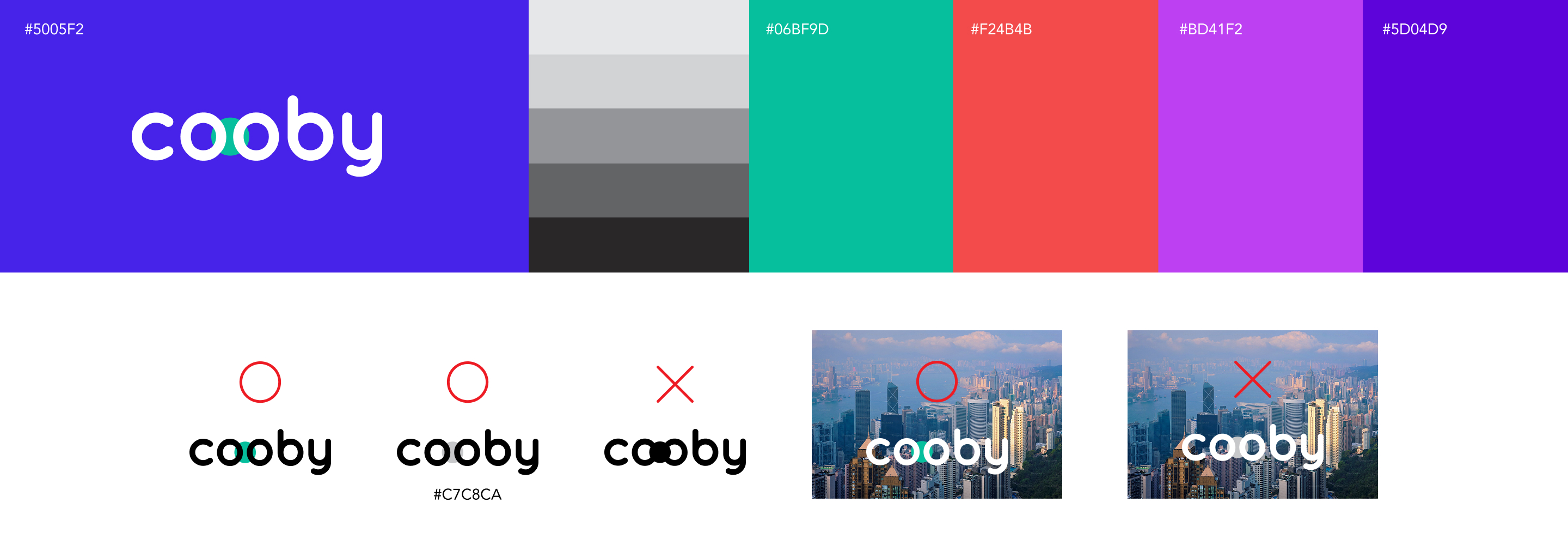
The CEO referenced Dropbox as a visual benchmark: clean, modern, and approachable. With this direction, I chose Quicksand as the base typeface for the logo for its rounded, friendly geometry, and paired it with a bold brand color to help Cooby stand out.

03 App Icon
Cooby replaces the traditional notebook as a modern client management tool. With that as my starting point, I explored stationery motifs and narrowed the concept to a quill, a symbol that carries both professionalism and a personal touch. Through an origami-inspired process, I gradually distilled the form into smooth, streamlined curves, giving the mark a sense of minimalism and elegance.